The contents of this course are derived from the CSS Grid Crash Course located on The Codevolution YouTube Page.
While this is not a completely exhaustive list, what follows is an extensive list of topics to get beginners going. I found a lot of value in the crash courses when I was first beginning to code and took extensive notes as I followed along. So, in coder fashion, I made websites out of the content and deployed them through Netlify
You can find the GitHub Repo with all of the code Here. The test.html file is a pre-setup html file that is used throughout the course to demonstrate the topics included in the course.
To access the testing site, click Here. For an interactive version, visit the GitHub repo via the link above and clone the Repo to your local machine while you follow along the course videos.
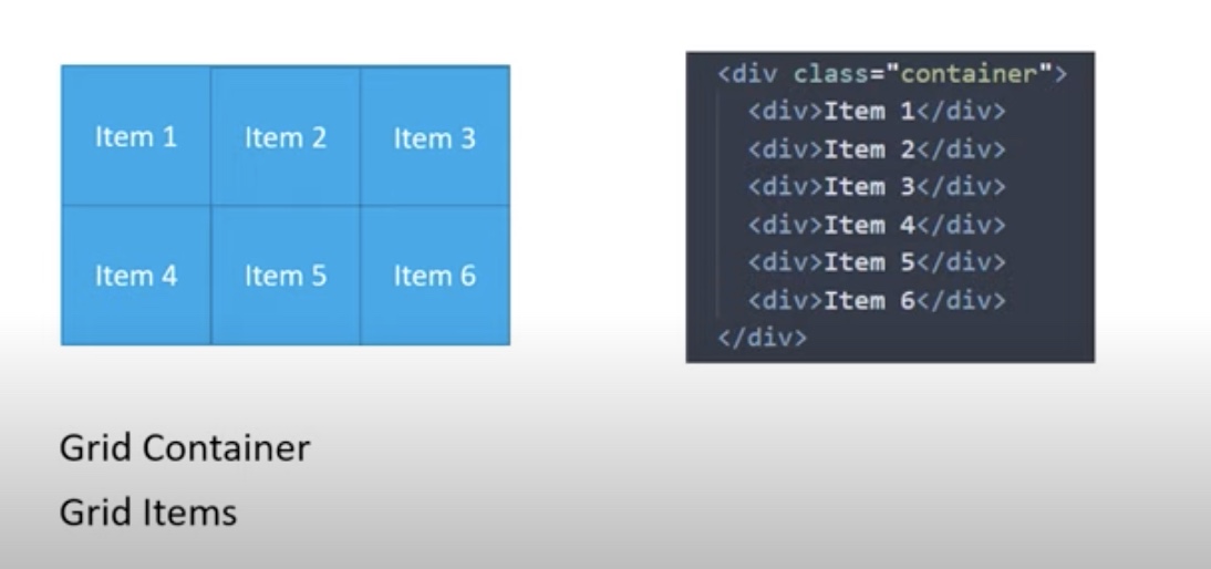
The CSS Grid Layout Module, simply known as CSS Grid or just Grid, is a two-dimensional grid-based layout system that is composed of 12 cells.
With rows and columns, Grid makes it easier to design web page layouts, align, and distribute space among items in a grid.
Flexbox is great for 1D layouts.
Grid is great for 2D layouts.
When you talk about CSS Grid, you are mainly talking about the parent container, which we call the Grid Container and the children elements, which we refer to as Grid Items.
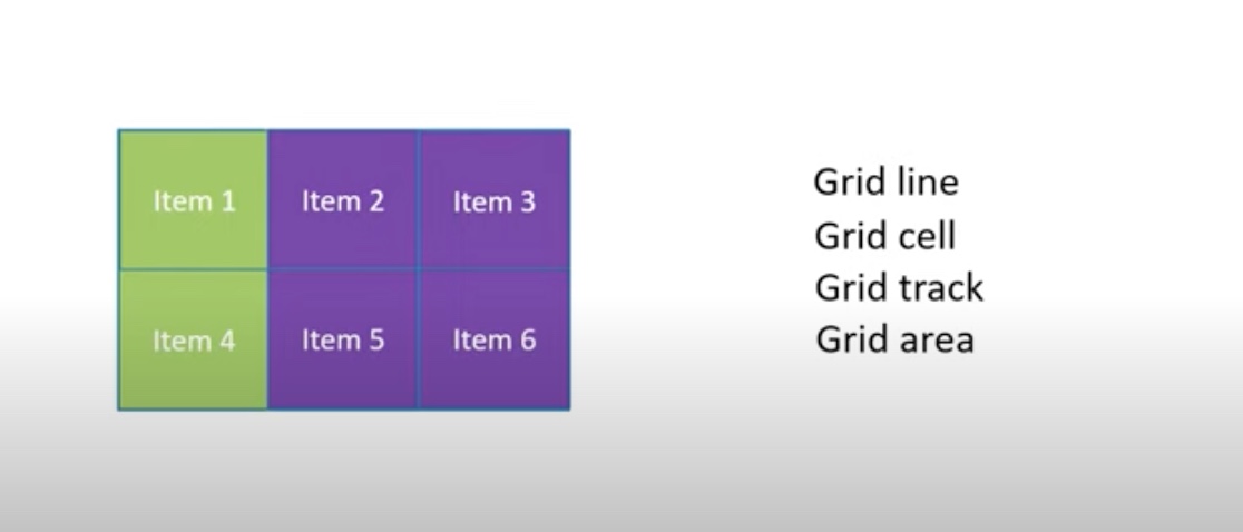
A Grid Line is the horizontal or vertical dividing line in a grid. If the line is vertical, it is a column grid line. If the line is horizontal, it is a row grid line.
A Grid Cell is the smallest unit that you can have on a grid. It is the space between four intersecting grid lines.
A Grid Track is the space between two adjacent grid lines. It is denoted by the green space in the image.
The Grid Area is the total space surrounded by four grid lines. It may be composed of any number of grid cells. It is denoted by the purple space in the image.
There are 18 total grid container properties.
The 18 Grid Container Properties Are:
Used to create either a block level or an inline level grid container.
Possible Values:
To create a grid container, we use a display property and set it to 'grid'. ie 'display: grid'
By default, display: grid creates a block level element. If you do not want a block level element, you can create an inline element by using 'display: inline-grid'
Specifies the number of columns in the grid layout.
The valuyes are a space-separated list where each value specifies the size of the respective column.
ie using. 'grid-template-columns: 100px 200px 300px;'
creates three columns. Columnn 1 is 100 px, column 2 is 200px, and column 3 is 300px;
If you want equal sized columns, simply set the desired size repeatedly.
ie. 'grid-template-columns: 200px 200px 200px;'
A better way to set a repeated size for multiple columns is the set the value to repeat and then declare the amount of times to be repeated and the size...
ie. 'grid-template-columns: repeat(3, 200px);'
It is also possible to set the width of the column as a fraction of the available space in the container by using 'fr'
ie. 'grid-template-columns: 1fr 2fr 1fr;'
In the example above, columns 1 and 3 would be given 25% of the space each and column 2 would be given 50% of the space.
Another function that is useful with grid is the minmax function.
You can specify any amount of columns and apply a minmax
ie. 'grid-template-columns: repeat(3, minmax(200px, 1fr));'
The column should be at least 200px, but can grow to take up the free space if available. At 200px, the items would stop shrinking and start to overflow.
Specifies the number of rows in a grid.
The values are basically the same as grid-template-rows, except now you can designate the height of the rows instead of the width (column size)
ie. grid-template-rows: 100px 150px 200px; - three rows with their corresponding heights.
ie. grid-template-rows: repeat(3, 100px) 200px; - three rows with a height of 100px and one row with a height of 200px. In this example, the fourth row ends up being blank space at the bottom that is occupied by the grid container.
Like grid-template-columns, you can also specify a repeat function and a minmax function for rows
A shorthand for defining Rows and Columns.
It is specified by 'grid-template: grid-template rows / grid-template-columns'
ie. 'grid-template-columns: repeat(3, minmax(200px, 1fr));' 'grid-template-rows: repeat(3, 1fr);'
Becomes
'grid-template: repeat(3, 1fr) / repeat(3, minmax(200px, 1fr));'
Sets the gap between the columns in the grid.
Values can be any non-negative value or a percentage
ie. 'column-gap: 20px;
Sets the gap between the rows in the grid.
Values can be any non-negative value or a percentage
ie. 'row-gap: 20px;
Shorthand for specifying the column-gap and the row-gap.
Values can be any non-negative value or a percentage
ie. 'gap: 20px 20px;'
Aligns items within a container along the row axis. Applies to all items within a container
Possible Values:
The default value of justify-items is 'stretch'
Aligns items within a container along the vertical axis. Applies to all items within a container
Has a default value of 'stretch'
Possible Values:
Shorthand for specifying align-items and justify-items. Applies to all items within a container
Values can be any non-negative value or a percentage and any possible combination of align and justify.
The first value is for align-items and the second value is for justify-items
ie. 'place-items: start end;' - item will be placed at the start(top) of the cell and to the end(right) of the cell.
place-items can take a single value, in which case the value will be applied to both align-items and justify-items.
ie. 'place-items: center' will place items both horizontally and vertically within the cell.
Justifies content along the row axis (horizontal) with respect to the container
By default, justify-content is set to start.
Possible Values:
Justifies content along the column axis (vertically) with respect to the container
By default, align-content is set to start.
Possible Values:
Shorthand for align-content and justify-content.
The first value is for align-content and the second value is for justify-content.
Values can be any possible combination of values for align and justify
ie. 'place-content: start end;' - places content at the start(top) of the container and to the end(right) of the container.
place-content can take a single value, in which case the value will be applied to both align-content and justify-content.
ie. 'place-content: center' will place the content both horizontally and vertically within the container.
Sets the default width for columns within the grid
Values can be pixels, percentages, minmax, and auto(default), etc.
Sets the default height for rows within the grid
Values can be pixels, percentages, minmax, and auto(default), etc.
Controls how auto-placed items get inserted into the grid.
The default value is 'row'
Potential Values:
Used to specifies areas within the grid layout
Shorthand for grid-template-rows, grid-template-columns, grid-template-areas, grid-auto-rows, grid-auto-columns, and grid-auto-flow
Controls on which grid column the content starts.
ie. grid-column-start: 1; - content begins on grid line 1
Controls on which grid column the content ends
ie. grid-column-end: 3; - content ends on grid line 3
You can also specify a span instead, meaning the column must span however many columns you specify.
ie. grid-column-end: span 2; - content spans 2 columns.
This is the same as telling it to end on grid line 3.
Shorthand for grid-column-start and grid-column-end
ie. grid-column: 1 / span 2; - content will begin on column 1 and span 2 columns
Controls on which grid row the content starts
ie. grid-row-start: 1;
Controls on which grid row the content ends
ie. grid-row-end: 3;
You can also specify a span instead, meaning the row must span however many rows you specify.
ie. grid-row-end: span 2; - content spans 2 rows.
Shorthand for grid-row-start and grid-row-end
grid-row: 1 / span 2; - content will begin on row 1 and span 2 rows.
Deals with the horizontal alignment of a single item along the row axis
By default, the value is 'stretch'
Possible Values:
Deals with the vertical alignment of a single item along the column axis
By default, the value is 'stretch'
Possible Values:
Shorthand for align-self and justify-self
By default, the values are 'place-self: stretch stretch'
ie. place-self: start end; - the item will be placed at the column start(top) and the row end(right)
place-self can take a single value, in which case the value will be applied to both align-self and justify-self.
ie.
place-self: center; - will center the item along the column and row axis.