The contents of this course are derived from the CSS Flexbox Crash Course located on The Codevolution YouTube Page.
While this is not a completely exhaustive list, what follows is an extensive list of topics to get beginners going. I found a lot of value in the crash courses when I was first beginning to code and took extensive notes as I followed along. So, in coder fashion, I made websites out of the content and deployed them through Netlify
You can find the GitHub Repo with all of the code Here. The test.html file is a pre-setup html file that is used throughout the course to demonstrate the topics included in the course.
To access the testing site, click Here. For an interactive version, visit the GitHub repo via the link above and clone the Repo to your local machine while you follow along the course videos.
The CSS Flexible Box Module or simply known as Flexbox is a one-dimensional layout model
It allows you to design felixble and efficient layouts, align and distribute space among items in a container
Flexbox helps you arrange elements in a webpage with ease.
Flexbox provides a lot of flexibility to arrange items, adjust spacing, adjsut alignment, and adjust the order of items.
Before flexbox, there were four layout modes.
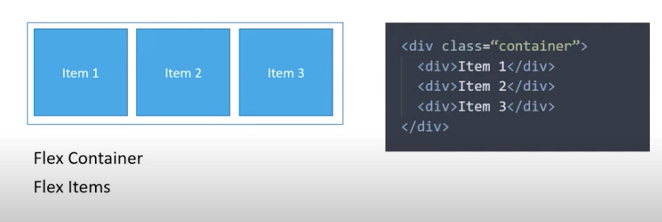
When we talk about flexbox, we mainly have two entities, a parent container, which we refer to as flex-container and the immediately children, which we refer to as flex-elements. Flex items are contained within the flex container.
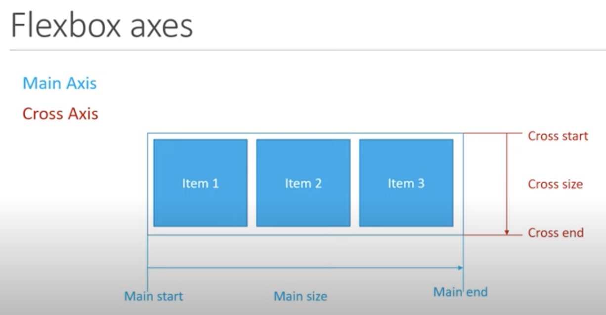
You deal with two axes with flexbox:
Main Axis
Runs left to right by default
Flex items flow from main start to main end and take up the main size as the length
Cross Axis
You can change the direction of the main and cross axes by changing how the items are laid out in the container.
There are ten total flex container properties
Display creates either a block level or and inline container. The possible values are 'display: flex' or 'display: inline-flex'
On the container class, we set the display: flex;
As with all properties with CSS, some initial values are defined. When creating a flex container, all of the contained flex items behave in a certain way.
First, they will display in a row.
Second, items start from the beginning of the left axis, the left most axis, but do not stretch to the end. However, they can shrink to a certain extent
Third, items will stretch to fill the cross axis, from the top to the bottom.
Also, from the border, the container itself has 100% width, so it does behave similar to a block level element. If you do not want a block level flex container, you can set the flex proeprty to inline-flex and create an inline flex container.
After setting the property to inline-flex, the border wraps around the container instead of filling the full width to accomodate its children.
Flex Direction establsihes the main axis, which in turn decides how the flex items are placed within the container.
By default, the main access flows from left to right, which is the reason why the initial items are placed from left to right in the browser.
By changing the direction of the flex property, we can change the order of the flex items displayed
There are four possible values for flex-direction:
There are three possible valus for flex-wrap
Vertical wrapping of items is also possible. For that, we need to change flex-direction to column and add a height to the flex container.
Flex flow is a short hand for both flex-direction and flex-wrap. The first value is the flex-direction and the second direction is the flex-wrap.
ie. flex-flow: 'flex-direction''flex-wrap';
By default, the flex-flow is set to row and nowrap, which are the default values of each of the indvidual properties.
You can type any possible combination of the direction and wrap values and the container will adjust.
Sets the gap between columns.
Values can be a non-negative value or a percentage.
ex. column-gap: 20px;
gives a gap of 20px to the columns.
Sets the gap between rows.
Values can be a non-negative value or a percentage.
ex. row-gap: 20px;
gives a gap of 20px to the rows.
Gap is shorthad for row-gap and column-gap. The first value is row-gap and the second value is column-gap.
ie. gap: 'row-gap''column-gap'
Values can be a non-negative value or a percentage.
You can type any possible combination of the row and column gap values and the container will adjust.
Defines the content along the main axis. Used to align items and distribute any extra spacing in the parent container.
Possible Values:
Align Items defines the default behavior for how flex items are laid out across the cross axis of the container. It works just like justify-content, but in the perpendicular position.
To visualize the changes, you need a height on the container.
Possible Values:
The align content propety aligns lines of content along the cross axis, similar to how justify-content justifies content along the main axis.
A very important condition is that multiple lines or rows must exist within the container, otherwise the property doesn't have any effect.
First, make sure to have a height on the container and also enable wrapping of items.
Possible Values:
Order is an integer value used to determine the order in which items appear.
By default, the order of all flex items is 0. You can change the order in which items appear on screen by using 'order: number', ie. 'order: 1', 'order: 2', etc.
If you specify the same order number for two or more items, the items will appear in the order in which they appear in the source code.
Flex-grow specificies what amount of space inside a container the item should take up if necessary. It is always relative to the other children within the flex container.
By default, all flex iems have a value of 0 and only take up the amount of space required to fit the content.
ex. 'flex-grow: 0;', 'flex-grow: 1;'. 'flex-grow: 3;' etc.
If you want all of te items to grow to take up the extra space evenly, you simply add flex-grow: 1 for all items.
Flex shrink defines the ability for a flex item t shrink if necessary.
Unlike flex-grow, the default value for flex-shrink is 1 on every item.
Specificies the inital size of a flex item before the extra space in the container is distributed. This is used in place of the width property in flex layouts.
It can accept values such as: pixels, percentages, values, rem, or even keywords like auto.
By default, flex-basis has a value of auto.
flex-grow and flex-shrink apply on top of flex-basis.
For example, if you set flex-grow: 1 on item 1, the extra space is added on top of the 200 px.
Flex-box doesn't try to decrease its growth just because it is larger than the other items to begin with.
Flex is shorthand for flex-grow, flex-shrink, and flex-basis.
Although you can designate grow, shrink and basis individually, Flex is the recommended method.
By default, flex has a value of 'flex: 0 1 auto;', meaning the items will no grow to fit the container, the items will shrink if necessary, and that the width of the items depends on the content.
The flex property can be specified using one, two or three of the values.
ie. .item{ flex-grow: 2; flex-shrink: 5; flex-basis: 200; }
You can shorthand the above by using:
.item { flex: 2 5 200px; }
Other examples:
flex: 2; flex: 10em; flex: 30px; flex: 1 30px; flex: 2 2; flex: 2 2 10%; etc...
Used to control the alignment of individual items.
The default value for align-self is auto.
Align-self is computed off of the align-items property of the parent container. align-self overides the align-items value fo the flex container.
The values are pretty much the same as the values for align-items.
align-self: flex-start; - the item will be pushed to the beginning of the cross axis align-self: flex-end; - the item will be pushed to the end of the cross axis align-self: center; - the item will be centered within the cross axis. align-self: stretch; - The item will be stretch across the cross axis.